After years of joking about the Alphabet Soup nature of LGBTQ "branding," me and my queer creative friends finally decided to take a stab at creating something that is both clear and simple as it is adaptable and inclusive.
Long story short (see below for the long story long): "Queer Together" is our attempt to celebrate the entire LGBTQ Family.
LONG STORY LONG
For many, "Queer" has historically been a jeer used by bullies big and small. For many of us, it's become a cheer and a celebration. While we realize "Queer" doesn't work for everyone, it works for us and many others.
The slogan "Queer Together" quickly popped in our heads and out of our mouths while we were working. Seemed too obvious, but no one could remember hearing it before. Surely someone must have trademarked it, right? We checked and found nothing. We did a Google search for other designs and only found one.
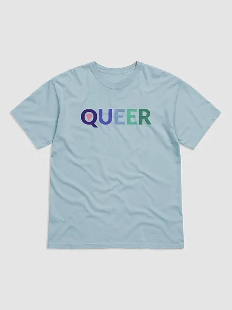
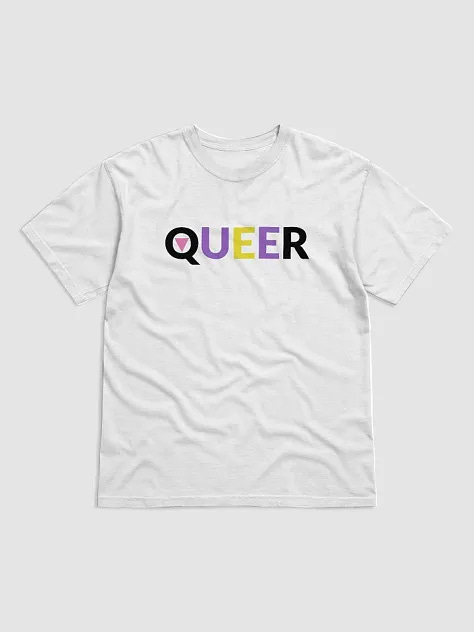
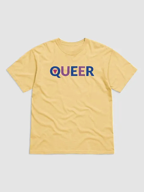
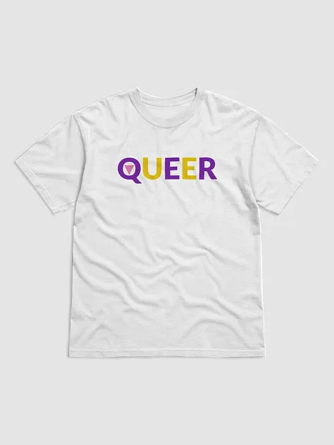
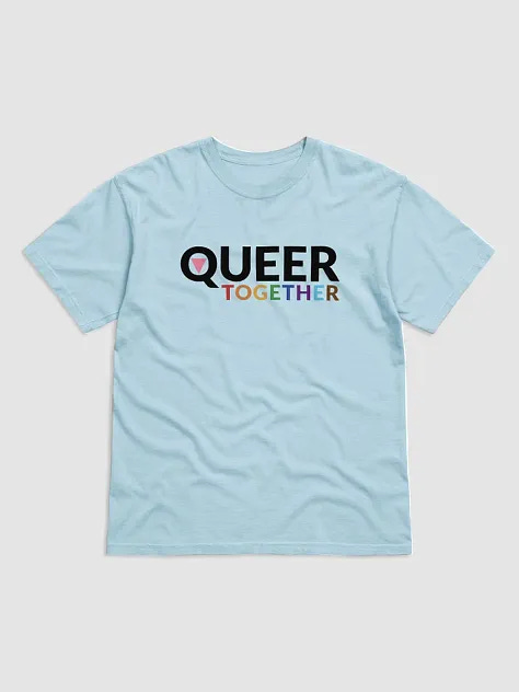
So we kept going. We tried various color combos, based on actual LGBTQ flags. We recreated "Queer" versions of most of them. Some with simplified color palettes, but keeping with the spirit of their flags and the communities they represent.
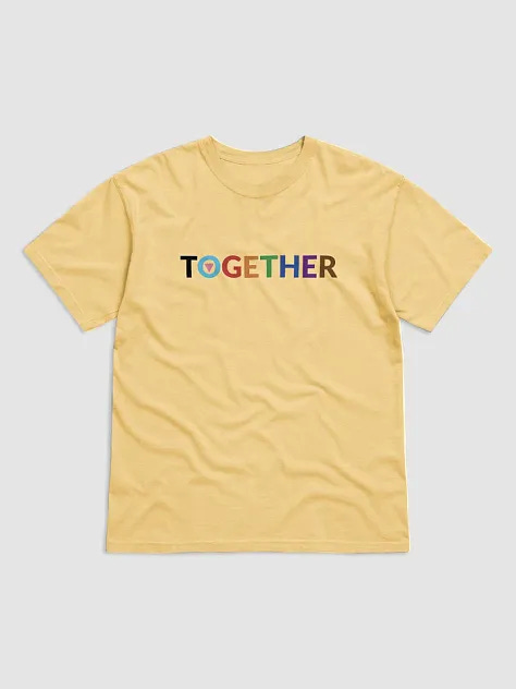
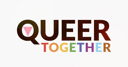
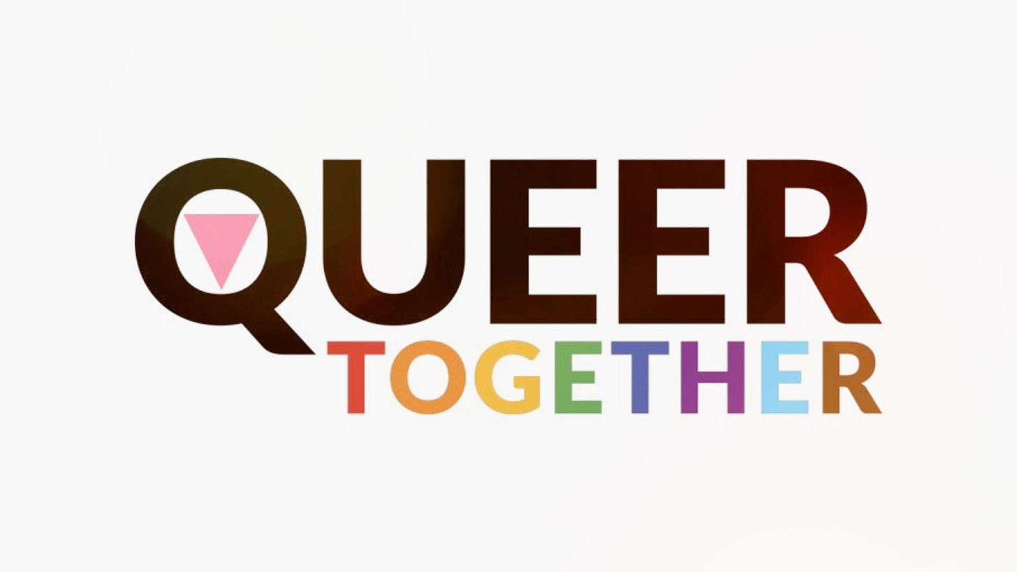
In addition to the color combos and a sans serif typeface (we chose the freely-available Lato by Łukasz Dziedzic), the only other element we used is a pink triangle.
While the shades of pink vary, the placement (in the center of the Q in "Queer" and the center of the O in the standalone "Together") is intended to honor the LGBTQ lives lost during the Holocaust and the AIDS epidemic.
THE LGBTQ FAMILY TREE
As Queer Artists & Designers, we created "Queer Together" to encourage more inclusivity and unity within the LGBTQ Family. In our mind's eye, the design can be viewed as a family tree. While the branches are all formatted uniformly, each branch retains its own personality and showcases the various colors and facets of its LGBTQ lineage. The tree's roots, strong and interconnected, emphasize the unity that binds us all, regardless of our specific identities.
"Queer Together" isn't just a design. It's a statement. A declaration of love and acceptance for all who identify as LGBTQ. It's also a reminder that we are all part of a vibrant and ever-expanding community, and that our differences can make us stronger.
After sharing the initial designs on social media, a follower suggested a standalone version of "Together" might appeal to those who find "Queer" problematic. Great suggestion and solution. One and done!
"Queer Together" not only acknowledges the presence of different LGBTQ identities but actively celebrates them. By using the term "Queer" across the spectrum, it promotes a sense of togetherness, reminding us that there is strength in our diversity. The design's bold use of color ensures that every branch on the tree is encouraged to be and express itself while being part of a larger family.
For the Collide Press Crew, "Queer Together" is a call for more acceptance, love, and unity within the LGBTQ communities. It encapsulates what we see as an inclusive term that brings us all together in celebration of our collective and individual identities.
SELECTIONS FROM THE COLLECTION
